
User Experience Options
he AppLife Update solution provides a choice of options for integrating an updating user experience into your applications. Using the visual controls included with AppLife Update, you can very quickly integrate a complete updating user experience into your applications. Many customizations are available through the properties of the controls.
You can also build your own updating user experience by utilizing the AppLife Update API. See the Custom Forms Quick Start for more information on building a customized user experience.
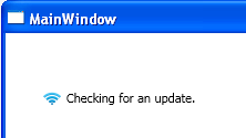
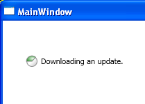
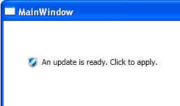
The UpdateDisplay control is designed to be placed on an application’s main interface, and upon startup, perform a background update check. If an update is present, a download is automatically initiated, with download progress indication. When the download completes, the control notifies the user that an update is ready to be applied.
This control utilizes minimal screen space, displaying a single 16 X 16 icon and a text label. The image and label is configurable by the DisplayMode property. Additionally, the image and text displayed when an update check completes, either with an update available or without, is customizable by setting control properties. Detailed information about the update is available as a pop up, through the control context menu or control click action.
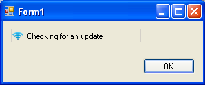
Checking for an update. (Animated image)
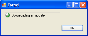
Downloading an update. (Animated with progress)
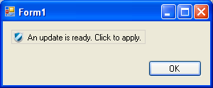
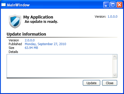
Ready to apply an update. (Customizable text and image)
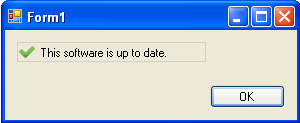
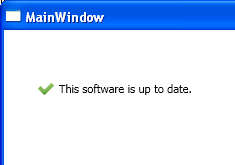
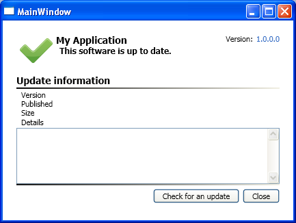
No updates available (Customizable Text and image)
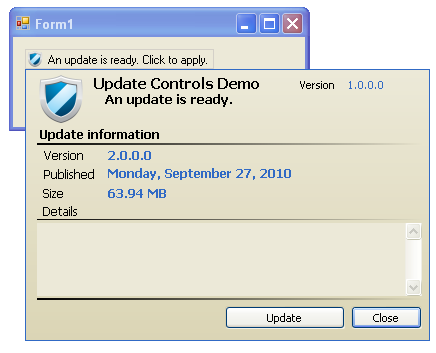
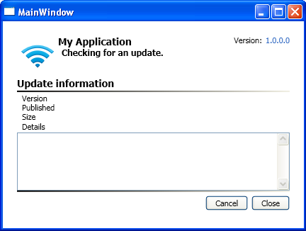
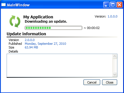
Update details popup.
The UpdateNotifyIconDisplay provides an updating experience through the windows system tray. No visual elements are present on the hosting form. This control can be used independently or simultaneously with other update display controls.
Checking for updates. (Animated image)
Downloading an update. (Animated with progress)
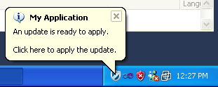
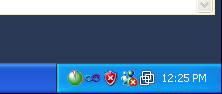
Ready to apply an update (Customizable text and icon).
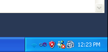
By default, no image is displayed in the system tray when no updates are available. This can be enabled and customized through the control properties.
The update details display control is designed to provide a drop in details panel onto an existing form.
Checking for an update. (Animated image)
Downloading an update.
Update is ready (customizable image and text).
No updates are available (customizable image and text).
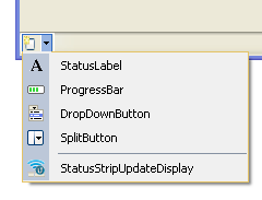
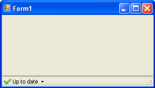
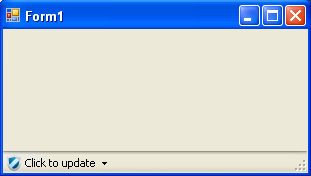
The StatusStripUpdateDisplay control provides an update experience that resides within a Windows Forms StatusStrip.
Note: This control does is not located in the Visual Studio toolbox. You can add it to an existing Status Strip using the Status Strip Control pane drop-down.
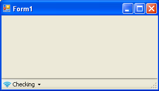
Checking for updates. (Animated image)
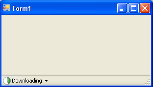
Downloading an update. (Animated progress)
No updates available (customizable image and text).
Update is available (Customizable image and text).
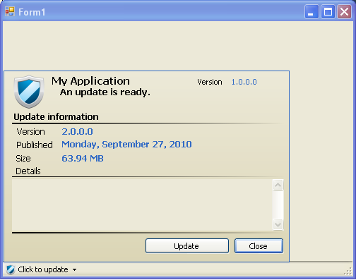
With details pop up open.
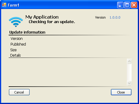
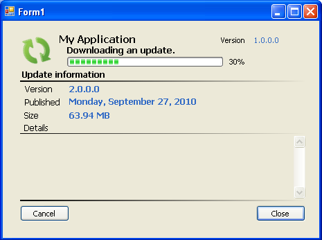
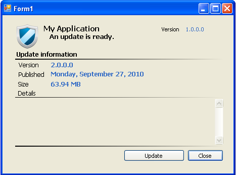
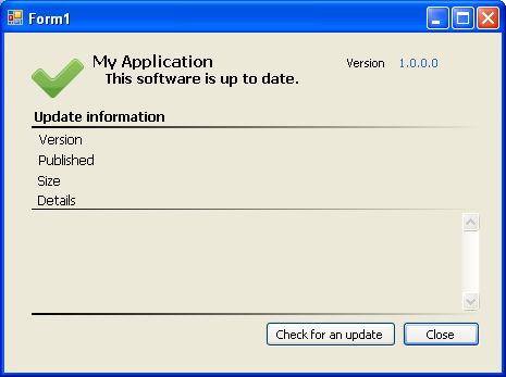
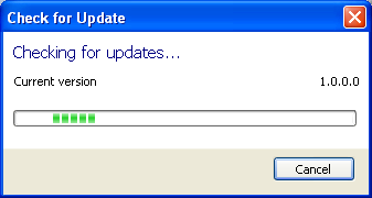
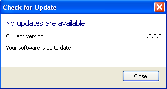
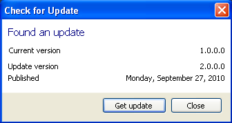
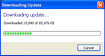
The update interactive user experience provides a dialog based updating experience. The update interactive user experience is launched by calling the UpdateInteractive method of the update controller.
The UpdateDisplay WPF control is a true WPF control that provides a user experience identical to the WinForms UpdateDisplay control. Being a WPF control, in addition to the property-based customizations available, the control can be re-templated to provide a customized look and feel. The control template can be copied from the AppLife Update installation directory (InstallDir/themes/generic.xaml).
The UpdateDisplay control is designed to be placed on an application’s main interface, and upon startup, perform a background update check. If an update is present, a download is automatically initiated, with download progress indication. When the download completes, the control notifies the user that an update is ready to be applied.
This control utilizes minimal screen space, displaying a single 16 X 16 icon and a text label. The image and label is configurable by the DisplayMode property. Additionally, the image and text displayed when an update check completes, either with an update available or without, is customizable by setting control properties. Detailed information about the update is available as a pop up, through the control context menu or control click action.
The WPF UpdateDiaplay control can be found in the Visual Studio WPF toolbox.
Checking for an update. (Animated image)
Downloading an update. (Animated with progress)
An update is ready (customizable image and text).
No update is available (customizable image and text).
The update details display control is designed to provide a drop in details panel onto an existing form.
Checking for updates.
Downloading an update.
An update is ready (customizable image and text).
No updates available (customizable image and text).
Auto Start
When auto start is enabled, the control will initiate an update process automatically. By setting the AutoStart property to false, the control will not initiate an update check automatically. When disabled, clicking on the control will initiate an update check, and the StartUpdateCheck method can also be used to programmatically initiate an update check.
Auto Hide (UpdateDisplay)
When the Auto Hide option is enabled, the control will perform the update check and download. When completed, if the user does not interact with the control, its visibility will fade to invisible after the designated period of time (in seconds). To enable, set the AutoHideDelaySeconds property to a non-zero value. The default value is 0.
Recheck Delay
The control can be configured to repeat an update check after a period of time by setting the RecheckDelayMinutes to a non-zero value. The default value is 0. For rechecks to occur, the control must also be configured to Auto Start.
Click Action (UpdateDisplay)
The Click Action option determines the behavior when a user clicks on the control. The options are:
•Update (default) – When the control is clicked and an update is ready to be applied, the update process is initiated.
•Show Details Form – When the control is clicked, the update details pop up is opened.
•None – Clicking on the control performs no action.
Display Mode
The control display mode determines the image and text display of an Update Display control. The options are:
•Image and Long Text (Default)
•Image and Short Text
•Image Only
•Long Text Only
•Short Text Only
When long text is selected, the status of the control shows a more verbose label than when short text is selected.
Application Name
When the application name property is set, it is displayed on the update details, system tray bubble, and tooltips.
No Update Text and Image
When the No Update Text and Image properties are set, these customizations replace the default image and text that the control uses in this update state.
Ready to Apply Text and Image
When the Ready to Apply Text and Image properties are set, these customizations replace the default image and text that the control uses in this update state.
Apply Update Options
The Apply Update Options property lets you configure the options available as an update is initiated.
UpdateReady Event
The UpdateReady event is raised on the controls when an update download is completed.
Show Close Button (UpdateDetailsDisplay)
A close button can be displayed on the Update Details Display by setting the ShowCloseButton to true. The CloseRequested event is raised when the button is clicked.
CloseRequested Event
The CloseRequested event is raised when the close button shown on the control is clicked.